Video aspect ratio describes the width-to-height shape of a frame. 16:9 fills a landscape screen, while 9:16 fills a phone held upright; choosing the wrong shape can create black bars, unwanted cropping, or hidden captions.
Table of Contents
- Understanding Video Aspect Ratio Fundamentals
- Aspect Ratio Quick Answer
- Three Properties That Get Confused
- Social Media Video Aspect Ratio Reference
- Protect the Safe Zone
- Match the Ratio to the Goal
- Compare Cropping and Reframing
- Shoot for Flexible Framing
- Choose Cropping or Padding
- Run Conversions with RenderIO
- Build a Three-Format Pipeline
- Add Testing and Failure Handling
- Check the File, Not Just the Preview
- Run a Preflight Check
- Can One File Serve Every Platform
- How Do You Calculate Padding
- Does Ratio Affect SEO or Reach
- What If the Ratio Is Slightly Wrong
Understanding Video Aspect Ratio Fundamentals
Think of aspect ratio as the frame around a photograph. It tells you how wide that frame is compared with its height, not how many pixels the image contains. A 16:9 frame is wide and cinematic; a 9:16 frame is tall and designed for full-screen mobile viewing.
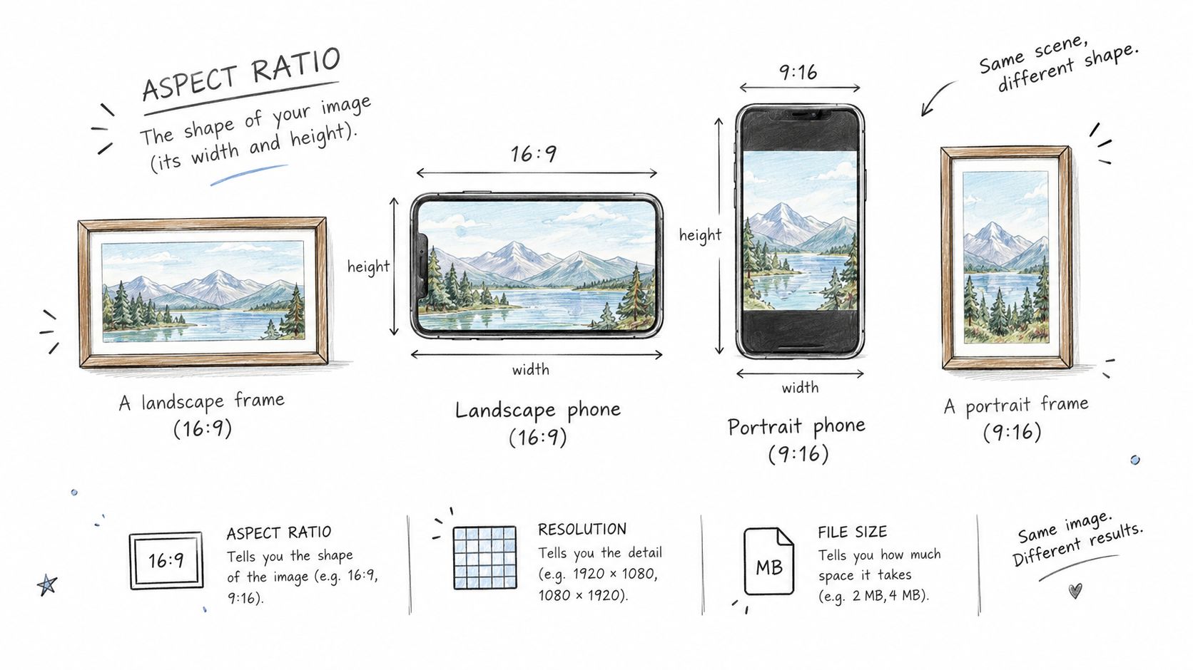
Turn your phone sideways to see the difference instantly. Upright, the display resembles 9:16; sideways, it becomes 16:9. The content has not changed, but the viewing window has.
Aspect Ratio Quick Answer
Here's the fast-lookup when you need it:
| Aspect Ratio | Orientation | Typical Use Case |
|---|---|---|
| 16:9 | Landscape | YouTube videos and televisions |
| 9:16 | Portrait | TikTok, Reels, and Shorts |
| 1:1 | Square | Social feeds and profile posts |
| 4:5 | Portrait feed | Instagram and Facebook feeds |
These four ratios cover the vast majority of what you'll encounter. Bookmark it and move on.
Three Properties That Get Confused
Aspect ratio is often confused with two separate properties:
- Resolution is the pixel grid, such as 1920 × 1080.
- File size is the storage space required, influenced by duration, codec, bitrate, and resolution.
- Aspect ratio is the frame's geometry, such as 16:9.
A higher resolution cannot repair the wrong frame shape. More pixels may make an image sharper, but they cannot restore a face or caption removed by cropping.
A mismatch becomes visible when a landscape master is placed inside a portrait player. The platform may crop the sides, add black bars, or shrink the video until it fits. Important text can disappear beneath interface buttons, while faces may sit awkwardly near an edge.
This guide explains platform requirements, safe framing, and practical FFmpeg conversions. It also shows how RenderIO can automate multiple versions, so one master file can become properly framed assets for YouTube, TikTok, Reels, and Shorts without repeated manual editing.
Choosing the right video aspect ratio is like selecting the correct window for a view. A landscape master placed in a portrait window loses its sides, while a portrait clip inside a landscape player gains empty space. Platforms may crop or add black bars automatically, which can hide important action and make polished content look unfinished.
Social Media Video Aspect Ratio Reference
Use this table as a practical 2026 starting point. The listed dimensions are recommended working canvases, not substitutes for checking each platform's latest upload rules.
| Platform | Recommended Ratio | Resolution | Primary Context |
|---|---|---|---|
| TikTok | 9:16 | 1080 × 1920 | Full-screen vertical short-form feed |
| Instagram Reels | 9:16 | 1080 × 1920 | Vertical videos in the Reels experience |
| YouTube Shorts | 9:16 | 1080 × 1920 | Mobile-first short clips |
| YouTube Standard | 16:9 | 1920 × 1080 | Landscape tutorials, vlogs, and long-form videos |
| Facebook Feed | 4:5 | 1080 × 1350 | Feed posts designed for scrolling |
| LinkedIn Feed | 1:1 | 1080 × 1080 | Professional square feed videos |
9:16 is the safest default for immersive mobile video. Google also documents native vertical output for YouTube Shorts workflows, confirming that portrait production can preserve quality without relying on a later crop. For broader repurposing advice, learn how to turn one video into platform-ready content.
Protect the Safe Zone
The full canvas is not the entire visible experience. Captions, usernames, profile icons, buttons, and calls to action can sit over the edges, especially in vertical feeds. Treat the outer margins like the border around a framed photograph.
Keep faces, product details, subtitles, and logos toward the center. A subject positioned safely in the middle usually survives interface overlays better than one placed near the lower-right corner.
Design for the canvas, but protect the center. The platform controls the interface around your video, so your critical message should not depend on edge space.
Match the Ratio to the Goal
A 4:5 video can be a strong feed choice because it occupies more vertical screen space than a square post while remaining suitable for scrolling environments. By contrast, 9:16 fills the phone display and creates a more immersive experience.
When the source and destination ratios disagree, choose deliberately:
- Crop when filling the screen matters most and the subject remains visible.
- Pad when preserving the complete frame matters more than edge-to-edge viewing.
- Reframe when faces, text, or motion move across the scene.
Before publishing, preview every version on an actual phone. A technically correct resolution can still fail if captions sit beneath controls or the crop removes the story's focal point.
Repurposing one master video for several platforms is like looking through a movable window. The scene stays the same, but changing the window from landscape to portrait decides which parts remain visible.
Center-weighted cropping works when the subject stays near the middle and the background carries little information. It's quick, predictable, and useful for simple interviews or product demonstrations.
However, naive cropping can cut off a face, remove a speaker's hands, or slice through a headline. Smart reframing tracks the person or action and shifts the window as the scene changes, making it the better choice for movement, dialogue, and multiple subjects.
A crop does not simply resize a video. It chooses what the audience is allowed to see.
Plan the safe zone before recording, not after editing. Keep the main subject near the center, leave comfortable headroom, and avoid placing essential details at the extreme edges.
- Shoot slightly wider than the final composition requires.
- Keep faces and products inside the central viewing area.
- Design titles and subtitles with generous margins.
- Leave space around hands, gestures, and moving objects.
The goal is a master that can survive portrait, square, and landscape windows without a costly reshoot. A centered composition gives automated tools more room to work, while wider framing protects action that might otherwise disappear.
Compare Cropping and Reframing
| Approach | Best For | Main Risk |
|---|---|---|
| Center crop | Stable, centered subjects | Loses edge action |
| Smart reframe | Movement and changing focus | Requires tracking |
| Letterboxing | Preserving the complete shot | Adds empty space |
| Manual edit | Important branded campaigns | Takes more production time |
This infographic visualizes recommended platform ratios, resolutions, and viewing contexts for six major social networks.
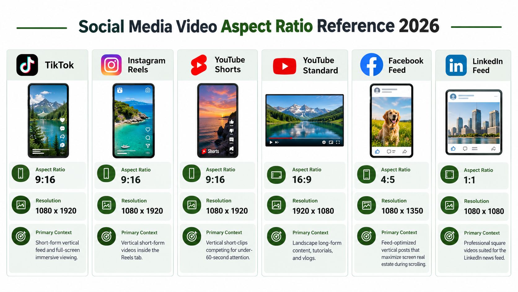
The key insight is that 9:16 dominates immersive mobile viewing, while 16:9 remains suited to standard YouTube, and 4:5 or 1:1 can preserve more visibility in scrolling feeds.
Shoot for Flexible Framing
During production, place important text inside the middle band rather than near the bottom or top. Platform controls can cover those edges, even when the exported video has the correct dimensions.
For practical conversion guidance, read our guide to converting horizontal video to vertical. Then preview every version on a real phone before publishing, because a technically correct video aspect ratio can still produce an awkward composition.
Once the framing is planned, conversion is where the right video aspect ratio becomes a repeatable process. FFmpeg can resize a master clip, preserve its proportions, and add padding when the destination shape doesn't match.
Choose Cropping or Padding
Stretching a 16:9 clip directly into a 9:16 canvas fills the screen, sure — but faces end up unnaturally narrow or wide, and on-screen text distorts in ways that are immediately obvious to viewers. Padding keeps the original geometry intact, adding space around the frame instead. Horizontal empty space on the sides is pillarboxing; vertical empty space on the top and bottom is letterboxing.
For a full-screen vertical crop that fills the canvas, this FFmpeg command does the job:
ffmpeg -i master.mp4 -vf "scale=1080:1920:force_original_aspect_ratio=increase,crop=1080:1920" -c:a copy tiktok.mp4
It fills a 1080 × 1920 canvas by trimming the excess from the sides or top and bottom. Works well when your subject sits comfortably within the crop zone — not at the extreme edges.
If you'd rather keep the entire frame and avoid any cropping losses, use padding instead:
ffmpeg -i master.mp4 -vf "scale=1080:1920:force_original_aspect_ratio=decrease,pad=1080:1920:(ow-iw)/2:(oh-ih)/2:black" -c:a copy vertical-padded.mp4
The decrease setting fits the source inside the target dimensions, while pad centers it on a black canvas. You can swap black for a brand color or even a blurred background if plain bars feel too harsh for the aesthetic.
Never solve a framing problem by stretching. Crop intentionally, or preserve the picture with padding. There is no third option that doesn't look wrong.
Going the other direction — say, preparing a 16:9 YouTube output from a smaller or differently shaped source — just reverse the dimensions:
ffmpeg -i master.mp4 -vf "scale=1920:1080:force_original_aspect_ratio=decrease,pad=1920:1080:(ow-iw)/2:(oh-ih)/2:0x202020" -c:a aac -b:a 192k youtube.mp4
Read also: how to crop a video without losing important content.
Run Conversions with RenderIO
Running one FFmpeg command locally is straightforward enough. Producing TikTok, Reels, Shorts, and YouTube variants for every single upload is a different problem entirely — that's where a cloud API starts to make sense.
RenderIO accepts FFmpeg 7.x commands through a REST endpoint, runs them in isolated environments, and returns processed files. No servers to manage, no queues to configure, no storage infrastructure to worry about.
From a single master file, you can kick off parallel jobs for:
- A 9:16, 1080 × 1920 vertical crop for TikTok, Reels, and Shorts.
- A 4:5, 1080 × 1350 padded or reframed feed version.
- A 16:9, 1920 × 1080 YouTube version.
RenderIO charges zero egress fees, sends webhook notifications when jobs finish, retries automatically on transient failures, and routes failed jobs to a dead letter queue instead of dropping them silently. Full FFmpeg stderr output is returned too, which makes debugging far less painful than squinting at opaque error codes.
For production reliability, there are two habits worth adopting immediately:
- Send an idempotency key with each request. If a retry fires due to a network hiccup, you won't end up with duplicate renders sitting in storage.
- Use signed URLs with expiration for both source and output files. Access expires after delivery, which keeps your content pipeline secure without manual cleanup.
Together, these patterns make automated video workflows repeatable and safe to retry — even when the network isn't cooperating.
Manual conversion breaks down fast when your AI content studio is pushing out hundreds of clips a day. The fix? Treat aspect ratio like any other data field in your pipeline — right next to account, campaign, language, and destination. That one shift turns constant editing into predictable processing.
Here's how it typically plays out. A new master video lands in cloud storage, and a trigger from n8n, Zapier, Make, or Pipedream sends the signed source URL and account settings to RenderIO, which handles FFmpeg commands through its REST API.
Build a Three-Format Pipeline
The automation spins up three variants at the same time:
- 9:16 at 1080 × 1920 for TikTok, Reels, and Shorts
- 4:5 at 1080 × 1350 for Instagram feed placements
- 16:9 at 1920 × 1080 for standard YouTube
Each job can apply its own crop, padding, watermark, subtitle style, or background. RenderIO returns job IDs, and a webhook signals when files are ready.
The master stays untouched. Every platform gets a frame built specifically for how it's watched.
For per-account customization, store settings at the account level. One brand might want blurred backgrounds with centered captions, while another uses branded padding, a different watermark, or a custom intro. Same source file, controlled creative variants — no manual projects duplicated across accounts.
Add Testing and Failure Handling
Growth teams can also spin up A/B versions without the chaos. Test cropped 9:16 against padded 9:16. Compare two caption positions while keeping the script, offer, and audience locked. Tag each variant with an identifier so you can trace it back to publishing and performance data.
But a successful first request doesn't make a reliable pipeline. Use idempotency keys to prevent duplicate renders, and set up retries for transient network hiccups or service blips. RenderIO covers most of this: progress tracking, webhook notifications, full FFmpeg stderr output, automatic retries, and a dead letter queue for jobs that still fail after attempts.
The flow looks something like this:
- Receive the source event
- Submit three rendering jobs in parallel
- Wait for webhook callbacks
- Store output metadata and publish-ready URLs
- Route failed jobs to review without blocking the other variants
Finally, keep storage honest with signed URLs and expiration policies. Source files can expire once processing is done. Output files stay available only within the delivery window your team actually needs. For studios and performance marketers, this turns aspect ratio handling into a programmable business function — not another daily editing headache.
Start with one recurring three-format workflow. Measure the failure rate. Then layer in account rules and creative tests as confidence builds.
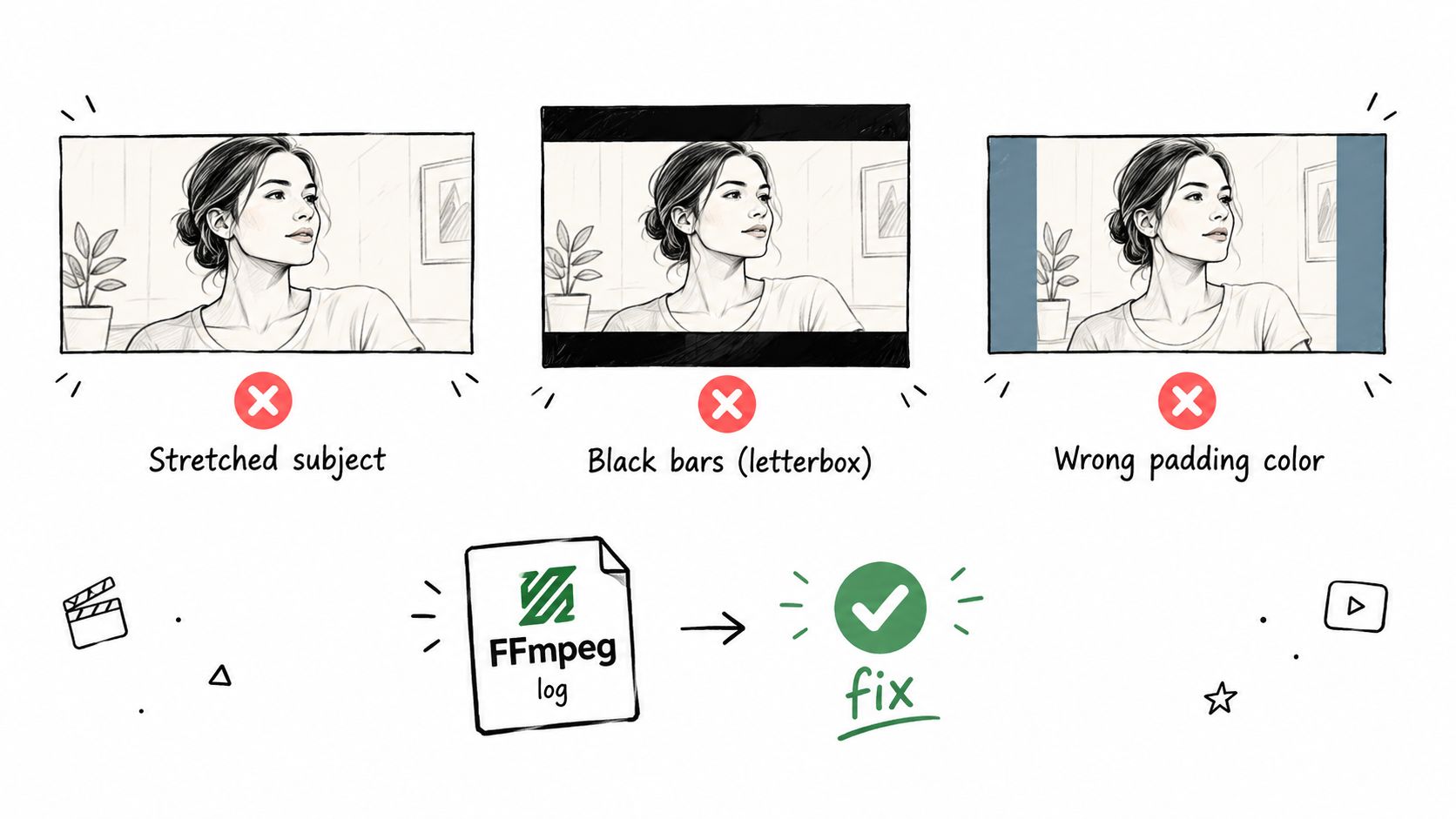
The most visible video aspect ratio mistake is stretching. Scaling a 16:9 master directly into 9:16 changes faces, logos, and text instead of preserving their proportions. Use intentional cropping or padding, never distorted resizing.
Black bars can also look unfinished when their color clashes with a platform’s interface. Test black, dark gray, brand colors, or blurred backgrounds against the actual feed, then check that captions remain inside the safe zone.
Check the File, Not Just the Preview
A video may appear correct while its metadata reports unexpected dimensions or rotation. Confirm the container, stream dimensions, pixel aspect ratio, frame rate, and codec with ffprobe before delivery.
Platform rejection often follows non-standard dimensions, odd rotations, or incompatible encoders. Use standard canvases such as 1080 × 1920, 1080 × 1350, or 1920 × 1080, then inspect FFmpeg’s stderr for warnings about filters, timestamps, missing streams, or failed encoders.
Upscaling cannot repair framing. More pixels can sharpen an image, but they cannot restore content that cropping already removed.
With RenderIO, failed jobs return the complete FFmpeg stderr log, so you can identify the failing filter or input quickly rather than guessing. Its job history and dead letter queue also make repeated pipeline errors easier to isolate.
Run a Preflight Check
Before publishing or automating a conversion, verify:
- Ratio and resolution match the destination.
- Safe zones protect faces, captions, logos, and buttons.
- Padding color suits the platform and brand.
- Metadata reports the intended orientation and dimensions.
- Output playback works on both desktop and mobile.
A short validation step prevents distorted exports, hidden messaging, and avoidable platform failures. Test one representative file in RenderIO, review its logs, then lock the settings into your production workflow.
Can One File Serve Every Platform
Honestly, not really. You can upload a 9:16 file to YouTube without issues, but the platform was built around 16:9, so your video ends up surrounded by black bars or looking like a small rectangle in the middle of the screen. TikTok, Reels, and Shorts handle vertical content much more gracefully.
One master file might technically work everywhere, but platform-specific exports will always look better. Framing stays intact, captions land where they should, and you're not leaving screen real estate on the table. The FFmpeg commands we covered earlier handle this conversion in seconds.
How Do You Calculate Padding
Start by figuring out your source ratio and target canvas size. Scale the video so either its width or height fits inside the target, then subtract the scaled dimensions from the canvas. Divide whatever's left over by two to get your padding values.
Take a 1920 × 1080 source going into a 1080 × 1920 canvas. You scale the source to 1080 × 608 to fit the width. That leaves 1312 pixels of vertical space, which means 656 pixels of padding above and below your content.
Padding preserves the complete image; cropping prioritizes a full canvas.
Does Ratio Affect SEO or Reach
On its own, aspect ratio isn't a ranking factor. Nobody's algorithm gives you bonus points for 9:16 over 4:5. But here's the thing — bad framing tanks retention. Viewers scroll past videos with chopped-off faces or unreadable captions. That hurts completion rates, which definitely affects performance.
Stick with what each platform recommends right now. It changes more often than you'd think.
What If the Ratio Is Slightly Wrong
A few pixels off usually won't get your upload rejected. You might see minor cropping, thin black bars, or some automatic resizing. Nothing catastrophic. But subtitles hugging the bottom edge? Those get cut off. Faces near the frame border? Partially visible. Always check your export before hitting publish, or let RenderIO generate corrected variants automatically.
RenderIO turns FFmpeg video conversions into reliable, scalable workflows. Start your free trial.